2026
KRUSH: Designing for Cultural Resonance
Uncover what can make connections culturally distinct for Asians, and translate those insights into KRUSH's mobile experience.
Timeline
8 weeks
platform
KRUSH ios mobile app
Role
UX Researcher
team
Chloe Dahan, Mandy Chiang, Yung-Wei (Amy) Chen
UX Research/Design
B2C Design
Usability Research

Project Summary
Uncover what can make connections culturally distinct for Asians, and translate those insights into KRUSH's mobile experience.
KRUSH is a dating and social community platform centered on Asian cultural identity. This project evaluates the core mobile user experience of KRUSH, focusing both on usability issues and discovering whether these Asian cultural values successfully coming through in the app experience and drive deeper user engagement.
Sneak Peek of Outcome
Shifting interface structures toward actual Asian dating behaviors and deep relationship philosophies.
We conducted six 1-on-1 moderated user testing sessions completing four tasks, aiming to make cultural connections distinct and discoverable for users. Here is a simple breakdown of the main outcomes we achieved.
01
Designed Ways to Break the Ice in conversation
02
Clarify the Interface Language
03
Turned Flat Profiles into Deep Value Matching
04
Gave Global Tab a Clear Purpose
Background
KRUSH, an Asian dating application valued on its cultural identity framework, is looking for more "Asianness".

To break away from mainstream swiping fatigue, KRUSH combines a card-based Discover feed, a Global tab featuring a globe for cross-border connections, a Community/Events tab for curated meet-ups, and a Matches tab.
For this project, our client, KRUSH's founder, Stephen Moon, has directed the team to explore how to better emphasize "Asianness" in the product. Therefore, our evaluation including research questions, tasks, and probes was designed not just to evaluate usability, but to capture how cultural identity, heritage, and the bicultural Asian-diaspora experience should manifest in the matching experience.
Research Goal
Our goal was to uncover the unique nuances of Asian matchmaking.
We evaluated the KRUSH iOS app paid version to capture how cultural identity, heritage, and the bicultural Asian-diaspora experience should manifest uniquely in the matching, browsing, and conversation flows.
Research & Analyze
Turning Stories and Needs into Measurable Product Gaps.
1 - The Kickoff with KRUSH
We kicked off the project with Stephen (the CEO of KRUSH) to align on their core needs. The client challenged us to explore how to improve match quality, strengthen cross-border communication, and deeply emphasize "Asianness" within the product.
As a team, we realized this research should go beyond simple usability issues, focusing instead on whether KRUSH’s cultural identity framework successfully creates a more meaningful experience .

2 - Looking Outside: Competitive Audit
To understand how culturally focused apps approach this challenge, we audited five direct competitors: BLK, Lox Club, Muzz, Dil Mil, and Caribbean Cupid.
While these platforms successfully integrate cultural specificities (such as granular religious filters or community chat rooms), they also share a critical flaw: their cultural depth collapses into stereotypes or checkboxes.
3 - The 1-on-1 Moderated Usability Sessions
45-to-60 minute in-person sessions at the Pratt Manhattan UX Lab Center. Users performed four tasks (Profile Setup, Discover & Global, Matching & Conversation, Events & Community) while thinking aloud. To gather deeper context, our moderators asked direct, in-context follow-up questions after each task.

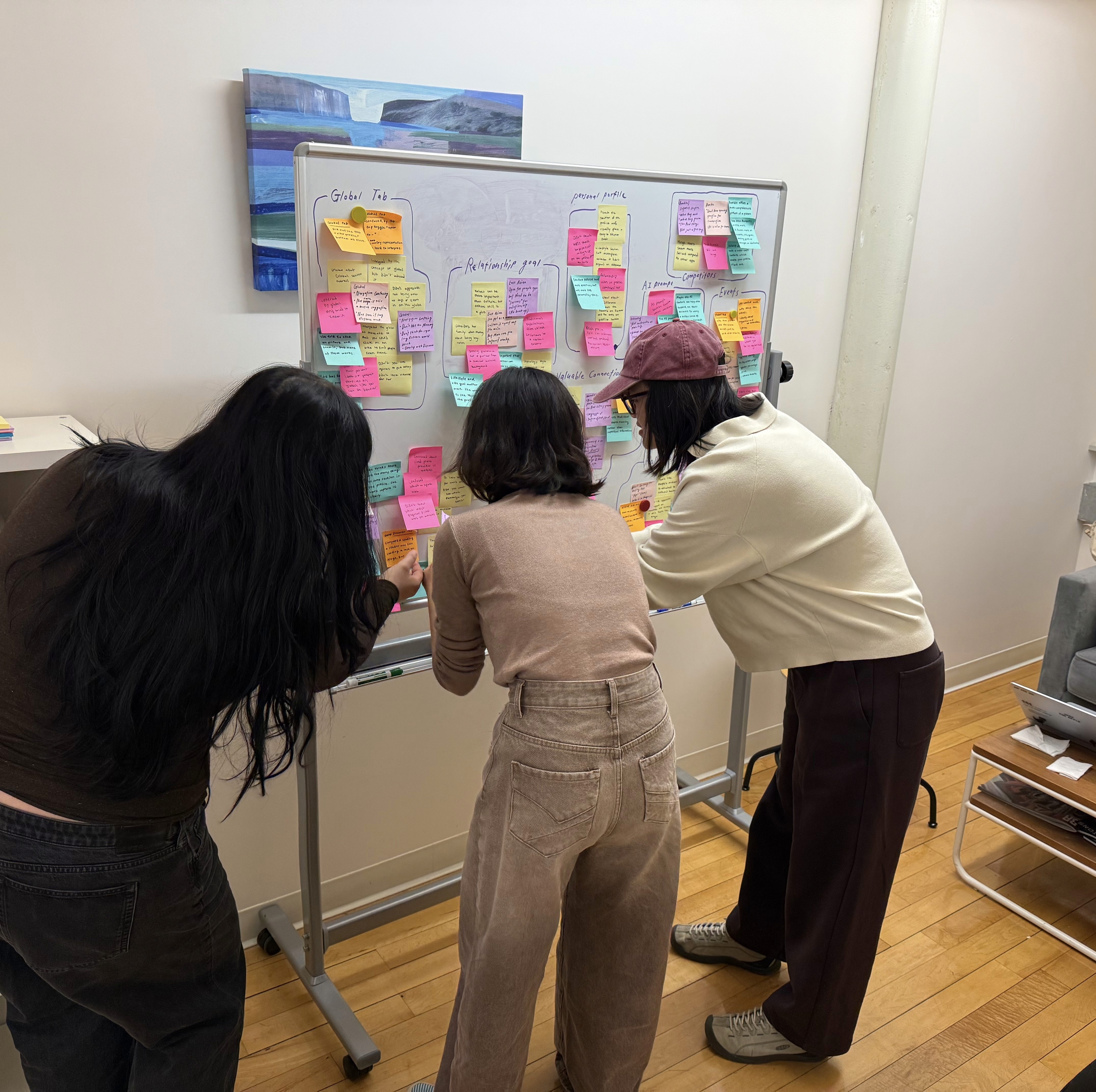
4 - From Data to Discover patterns: Affinity Mapping
Once data collection was complete, our team of three researchers independently reviewed all recorded video sessions and notes. We used Affinity Mapping to group observations and participant quotes into recurring patterns.
Through this systematic analysis, we discovered a clear gap: The interface requires much deeper, context-aware interaction scaffolding to support users.
Overall Results
KRUSH got a strong foundation but lacked deeper insight into the diverse identities within the Asian community.
Across the six sessions, our participants were impressed about the Events feature. It feels like a low-pressure way to meet new people, and they also think it is a really unique feature that they did not see on any other dating apps. Also, the identity sharing on the profile helps them to share their identity through labels like cultural identity, religion, and prompts.
However, users wanted culture to more widely show up through behaviors, prompts, food, holidays, family expectations, and relationship philosophies instead of flat labels and prompts.
Below are the three core issues we identified.
Problem 1
Profile Labels Feel Too Flat Instead of Showing Real Cultural Life.
KRUSH’s interface relied heavily on structural classification tags (language, generation status, ethnicity) that reduced the lived, bicultural experience into flat variables.
In both lifestyle and personality sections, all participants were struggled to find meaningful cultural signals to evaluate deep compatibility. For instance, users expressed a desire for more detailed information in lifestyle, such as the top five favorite activities or long-term life goals, also, in personality section, while "Dating Goals" are provided, high-intent users want to move these simple labels toward deeper relationship philosophies.

Problem 2
Users Feel They Are Left On Their Own Immediately After Matching.
The moment between matching and starting a conversation surfaced the most consistent friction in the app. Participants liked a profile, opened a match, and then stalled, staring at a blank message field with no contextual support. Also, they were confused with the meaning of various interaction labels (Heart, Spark, Like).

Problem 3
Discover and Global Tabs Feel Too Identical Without a Clear Distinction.
KRUSH currently offers two discovery surfaces, Discover and Global, that ask users to do the same thing in slightly different visual containers. Although Discover felt familiar to participants because it followed swipe conventions, Global felt confusing because it borrowed those conventions without clarifying what was different about them.

Moving from Insights to Action
KRUSH lacked the interface logic to translate that identity into smooth user interactions.
Our findings proved that KRUSH’s core hurdle wasn't a shortage of features, but a missing layer of intuitive design. The real opportunity was to make the existing experience smoother and turn flat profiles into conversation starters. Instead of adding features, we focused on making the cultural identity framework feel meaningful and connected.
Recommendation 1
Bring Profiles to Life by Layering Cultural Behavior and Shared Values.
Expand Lifestyle Labels
Instead of a binary option of Serious Relationship, Casual Dating, and Friendship for the dating goal label, we recommend KRUSH offer a short, culturally nuanced relationship value quiz. This quiz could cover dating goals, family values, ideal first dates, and what they value in a partner.

Assessments for Deeper Relationship Values
The Lifestyle section should be broadened to offer a more diverse range of descriptors, such as weekend activities, go-to sports, and favorite cuisines. For users who wish to share more, KRUSH can also provide corresponding AI prompts to fill out, enabling users to share more deeply.

Highlight Commonalities
Current profile information is excessive, leading to cognitive overload during the browsing process. We suggested using distinct colors to highlight similar points between users and display a similarity percentage at the top of the profile.

Recommendation 2
Bridge the Matching-to-Conversation Gap, by A Culturally First-Message Scaffold.
Clarify Interaction Language
we recommend adding a subtle, first-use tooltip or a "Feature Legend" in the user settings. This ensures that the interaction language remains on-brand and playful while providing the "upright" clarity high-intent users need to navigate the app with confidence.

Context-Aware, Culturally Grounded Openers
When a match is made, the app should surface "Dynamic Icebreakers" automatically generated from shared profile attributes. Instead of generic prompts, these focus on specific cultural bridges and personal identity (e.g., Heritage & Tradition: "You both mentioned a love for [specific cultural dish]; ask [Name] where they find the best version in the city.").

Transform Post-Match into a Date-Planning Aid
Rather than bouncing the user back into the swipe stack, introduce a summary of the match's favorite things (e.g., Thai food, quiet parks) to serve as a built-in date-planning hook.

Recommendation 3
Give Discover and Global Clear, Separate Roles.
Our strategy is to split the app logic: Discover is explicitly for finding who is nearby right now, while Global is for finding shared roots anywhere in the world.
To make differentiation legible between Discover and Global, here are the four recommended design strategies.
Global Enviornment Redesign
Transformed into a browse-by-region, curated environment specifically built to surface heritage, language fluency, and cross-border alignment over physical proximity. We added an explicit functional subtitle ("Find your person, anywhere"), replaced the country flag and global icon toggle with a persistent labeled segmented control, and added a scrollable row of profile cards showing multiple people at once with a "why this person" badge on each card to replace the single-profile presentation that limited browsing.

Trustworthy Filter Feedback
We promoted Country and Language filters directly out of advanced settings and into clear, interactive pill elements positioned above the globe. Filters apply immediately and visibly, updating pins and re-centering the globe on selected regions.

Add a "Global Context" Badge to Profiles
Provide a contained call-out block appears above the standard profile content when users open a profile they matched with from the Global tab. The call-out renders only when the entry context is Global which keeps Discover uncluttered.

Persist Global Context Through Matches
Add a persistent Global indicator badge anchored to the chat profile photo, and reframe the connection system text line to read: "You connected with {Name} on Global," ensuring the match always remembers its original context.

Reflection
How We Crafted the Right Questions and Gave Users Space to Share.
For this project, we looked beyond whether users faced usability issues. We wanted to deeply understand how culture impacts a dating app—how users express themselves, what cultural elements they look for when matching, how they build trust, and how they start meaningful conversations. Because of this, I realized the importance of carefully crafting our user tasks and follow-up questions before the sessions.
Additionally, I realized that because our project touched on sensitive topics like dating, heritage, and personal identity, our testing required extra care. I learned how to ask neutral questions so participants wouldn't feel uncomfortable. Since this topic is highly personal, users sometimes needed extra time to open up or think. I learned that giving them proper pauses and moments of silence is a great way to let them gather their thoughts, which ultimately led us to discover more valuable insights.