2026
Wikipedia Android App: Accessibility Audit
An accessibility audit of the Wikipedia Android app, focusing on removing digital barriers in the onboarding and article-editing processes.
Timeline
4 Weeks
platform
Wikipedia Android App
Role
UX Researcher
team
Robert Rivera, Carlos Soriano, Mandy Chiang, Ammara Fatima, Yash Wake

Project Overview
Breaking Down Barriers to Make Information Open to Everyone.
Wikipedia serves as a massive database of knowledge for millions of global users who are seeking to answer questions and accomplish daily tasks. As a design team, we conducted a comprehensive accessibility audit specifically focusing on two core user journeys within the Android app: the Onboarding Process and the Editing Experience.
Our goal was to evaluate how the current interface handles the needs of users with disabilities and to ensure the application remains inclusive and provides more users access to information.
Click to view the full report and analysis.
Research Process
To ensure our audit directly focused on the real-world needs of users with disabilities 👀
We followed a structured research process below.
1 - Define the Disability
We analyzed specific traits of different disabilities that are most relevant to a text-heavy, collaborative editing platform like Wikipedia.
2 - Identify Barriers and Frustrations
We mapped out significant access barriers and common frustrations specific to mobile interfaces and Wikipedia's unique layout.
3 - Analyze Assistive Technologies
We listed the tools users depend on, what the Android system natively supports, and where the remaining gaps lie.
4 - WCAG Mapping
We selected which POUR principles (Perceivable, Operable, Understandable, Robust) and specific guidelines mattered most for our target groups.
5 - Create User Personas
We created two personas representing the most underserved groups in the Wikipedia app context.
What We Found
Behind the numbers, there is a real user.
Through our secondary research, we gathered critical global and national data that shaped our understanding of accessibility.
5%
of the world's population lives with disabling hearing loss.
15%
of adults in the US live with speech or language disabilities
1/7
disabilities in the US are related to motor and mobility issues.
10%
of US adults report experiencing hearing difficulties.
User Personas
Turning Data into Real User Stories.
To bring this data to life and understand how these obstacles directly affect daily app interactions, we translated these findings into two core user personas.
meet Maya
A user with cognitive and sensory impairments who relies on steady layout structures and clear screen reader feedback.

meet Brandon
A highly proficient tech user with visual impairments who needs seamless keyboard navigation and fluid interaction design.

Methodology & Evaluation Framework
How we designed a structured, persona-driven audit to evaluate Wikmedia’s user accessibility needs.
1 - WCAG Principles (POUR Framework)
We used the Web Content Accessibility Guidelines (WCAG) as our foundation. The framework focuses on four core principles, commonly known as POUR:
P
Perceivable
Information must be presentable to all users.
O
Operable
UI components must be navigable
U
Understandable
Content must be readable and predictable.
R
Robust
Content must be compatible with assistive technologies.
2 - Select Guidelines
Not all accessibility guidelines apply to every single user, so we filtered the guidelines through our user personas to focus strictly on what matters most to Maya and Brandon:

3 - Cognitive Walkthrough
This usability inspection technique allowed us to test the app directly through the eyes of our target users. These personas were created in order to understand how users with disabilities would navigate the application.

Findings
Finding the Invisible Barriers in the App.
We evaluated our findings across the Onboarding and Editing processes, rating each issue using a 3-tier severity scale:
Tier 1
Critical/Urgent
Tier 2
Important/Medium-term
Tier 3
Enhancement/Long-term
Note: In this section, we briefly cover both what works well and what needs improvement within the app to provide a clear, balanced overview. For a full checklist and detailed pass/fail criteria across all categories, you can review our Complete Accessibility Report.
Findings: Onboarding Process
The Onboarding Process
👍 What Works Well [Onboarding Process]
Perceivable
TalkBack functions smoothly with consistent icon and button labels. The flow uses a simple, linear layout that reads in the correct order , and screens adapt well to larger system fonts or zoomed displays.
Operable
Structure announcements and CTA locations remain predictable for screen reader users. Focus sequences follow a logical path, and external keyboard navigation allows smooth movement across screens without traps.
Understandable
Language clarity is strong in English with no unexpected interface changes. Back buttons and progress indicators appear in stable, consistent positions , and inputs retain persistent visible labels during typing.
Robust
Technical parsing on the app runs efficiently, allowing users to tab through the onboarding process easily. Task completions provide clear feedback, and a bottom status bar lets users track their progress.
🔧 Areas for Improvement [Onboarding Process]
1.4.1 Use of Color
Links in the onboarding are differentiated using only color. The TalkBack feature also does not specify that the text is a link.
2.4.4 Link Purpose (In Context)
Inline links inside onboarding descriptions (e.g., "Join Wikipedia", "Terms of Use", "Privacy Policy") are not accessible as individual interactive elements in TalkBack.
2.5.2 Pointer Cancellation
The "Skip" action is triggered immediately without confirmation, which can lead to accidental onboarding dismissal.
Robust Link Identification
Certain links on the onboarding page were not identified by the TalkBack function. Specifically the shortcut to create an account, meaning users were not able to click on those.
Findings: Editing Process
The Article-Editing Process
👍 What Works Well [Editing Process]
Perceivable
The editing toolbar icons feature well-maintained content descriptions announced correctly by TalkBack. All text and non-text elements maintain appropriate color contrast, and the content adapts well to larger display sizes in a logical sequence.
Operable
TalkBack correctly announces toolbar icons, states, controls, and active/disabled labels. Focus order remains generally logical within accessible regions, and exiting edit mode includes a confirmation dialog to prevent accidental work loss.
Understandable
Language and predictability are strong, with TalkBack reading all content in English with no unexpected changes. Navigation is consistent with recurring controls in stable positions, and article text/summary fields keep visible labels during input.
Robust
Technical parsing allows users to move smoothly through the workflows, and clear confirmations are given when users are done editing. Furthermore, the system status bar allows users to track their progress.
🔧 Areas for Improvement [Editing Process]
1.3 Sensory Characteristics
The editing process relies heavily on icon-only buttons (labeled consistently with TalkBack) do not show text labels when just viewing.
1.4.12 Text Spacing
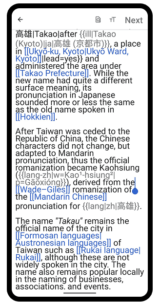
When text size is increased, the line spacing does not scale proportionally, causing the content to appear cramped and difficult to read. Characters visually merge with the lines above and below, reducing readability and making editing more challenging.
2.1.1 Keyboard
Keyboard focus cannot access top navigation and bottom formatting toolbar from the editor area.
2.1.2 No Keyboard Trap
Keyboard focus becomes trapped inside the editable HTML text area, preventing access to save and formatting controls.
3.3.1 Error Identification
When all content was deleted from an article, the app proceeded to the summarize screen with no error or warning announced by TalkBack.
3.3.3 Error Suggestion
When content was deleted and submitted, the app accepted the change silently with no corrective guidance provided at any point.
Recommendations
Making Navigation Easier and Preventing Mistakes.
To resolve the barriers discovered during our audit, we proposed the following design and code solutions from the presentation to improve system operability, error recovery, text readability, and inclusion
Recommendations: Onboarding Process
The Onboarding Process
[OPERABLE]
The "Skip" Action
Tier 3
Enhancement
Problem
Skip onboarding triggers immediately without confirmation or recovery option.
Recommendation
Add confirmation dialog before skipping onboarding.

[ROBUST, OPERABLE, PERCEIVABLE]
Inline & Missing Links
Tier 2
Important
Problem
Inline links inside onboarding descriptions are not individually accessible via TalkBack or keyboard navigation.
Recommendation
Floating buttons separated below the text can help to establish the button as it’s on link. Alt text can be added to the code in order for talk back to read instructions back to the user.

Recommendations: Editing Process
The Article-Editing Process
[PERCEIVABLE]
Text Overlap
Tier 2
Important
Problem
When text size is increased, line spacing does not scale proportionally in the editing experience.
Recommendation
Use relative line-height units in the edit field rather than fixed pixel values, so line spacing scales proportionally alongside font size when system accessibility settings are applied.
[OPERABLE]
Keyboard Access & Navigation
Tier 1
Critical
Problem
Toolbar and navigation controls are not reachable from editor focus using keyboard.
Recommendation
Ensure full logical tab order between editor, toolbar, and navigation controls.

[OPERABLE]
Keyboard Traps
Tier 1
Critical
Problem
Focus is trapped inside editable HTML text area, preventing access to other controls.
Recommendation
Allow focus escape routes from editor into navigation and toolbar elements.
[UNDERSTANDABLE]
Silent Deletion
Tier 1
Critical
Problem
When all content was deleted from an article, the app proceeded to the summarize screen with no error or warning announced by TalkBack.
Recommendation
The app should automatically detect large content deletions and announce a warning through TalkBack when the preview screen loads.
Reflection
Accessibility is a Mindset, Not Just a Design Checklist.
By reviewing disability research and building diverse user personas, I learned to step outside our own browsing habits and design with genuine empathy. I realized that what feels like a minor design choice to us can be a complete digital barrier to someone else, something I would have completely overlooked in the past.
This audit changed how I look at design. Moving forward, I won't treat accessibility as an afterthought or a compliance chore to complete at the end of a project. Instead, it must be the very foundation of how we build products from day one, ensuring that digital tools are open and welcoming to everyone.